
How to Make a Room Look Bigger with Paint? 34 Ideas & Tips
You can make a room look bigger with paint by choosing light-reflective colors, keeping contrast low, and painting the ceiling lighter than the walls. Color drenching, tonal schemes, and smart sheen choices also blur a room’s edges, so your eye stops noticing where it ends. These tricks cost far less than knocking down a wall, and most homeowners can finish them in a weekend.
This guide by Floor Land explains how each technique works, which rooms it suits, and where people usually go wrong. The advice draws on color theory, the way light behaves on painted surfaces, and practical lessons from real decorating projects. By the end, you will know exactly which colors to buy, where to put them, and how to test them before you commit.
Best Paint Colors to Make a Small Room Look Bigger
The right color for painting services depends on your light, your room’s purpose, and the feeling you want. Use the ideas below as a menu, not a strict formula.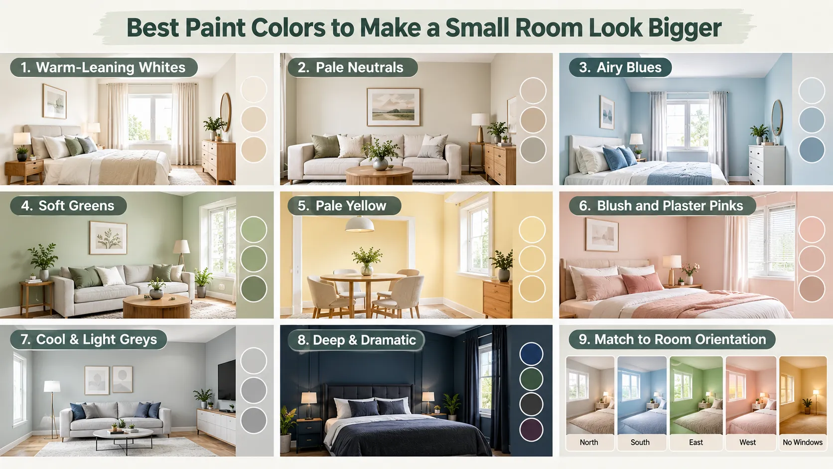
1. Start with Warm-Leaning Whites
White remains the safest choice for a small room, but not every white suits every space. Brilliant whites with a blue base can look grey and cold in rooms with weak daylight. Softer whites with a hint of cream, stone, or pink hold their warmth even on dull days.
Pick a white that matches your light. North-facing rooms usually need a warmer white, while bright south-facing rooms handle cooler, crisper whites well.
2. Try Pale Neutrals Instead of Pure White
Light greige, oatmeal, putty, and pale taupe offer white’s brightness without the harshness. These shades create a calm, layered backdrop that flatters wood, linen, and natural textures. They also hide scuffs better than stark white, which matters in hallways and family rooms.
3. Use Airy Blues to Push Walls Back
Pale sky blue, duck-egg, and powder blue make walls appear further away. They suit bedrooms, bathrooms, and home offices, where a calm mood helps. Choose a blue with a grey or green undertone if you worry that pure blue will feel chilly.
4. Bring in Soft Greens For an Open Feel
Sage, pistachio, celadon, and pale eucalyptus connect a room with the outdoors. Green sits in the middle of the visible spectrum, so the eye processes it easily and finds it restful. Soft greens work especially well in rooms that overlook a garden, because they extend the view indoors.
5. Choose Pale Yellow for Windowless Rooms
Buttery or cream-yellow shades reflect a large share of light and add a sunny glow. They lift basements, laundry rooms, box rooms, and internal bathrooms that never see daylight. Keep the yellow muted, since bright lemon tones can become overpowering on four walls.
6. Consider Blush and Plaster Pinks
Pale plaster pink and soft blush bring warmth without closing a room in. They glow beautifully in evening lamplight and flatter skin tones. These shades work well in bedrooms, dressing rooms, and cozy reading corners.
7. Lean on Cool & Light Greys with Care
Light grey can look sleek and spacious in bright rooms. In dim rooms, however, grey quickly turns flat and gloomy. Always choose a grey with a clear undertone, such as green, blue, or warm beige, so it keeps some life.
8. Go Deep and Dramatic in the Right Room
Inky navy, forest green, charcoal, and aubergine can make a small room feel limitless. The dark color blurs corners and creates a cocooning, gallery-like depth. This works best in powder rooms, snugs, studies, and bedrooms used mainly at night.
Commit to the whole room when you choose a deep shade. A single dark wall with white everywhere else often creates a heavy block rather than depth.
9. Match Color Temperature to the Room’s Orientation
The direction your windows face changes how every color looks. Use this quick guide before you buy samples.
| Window direction | Light quality | Colors that expand the space |
| North-facing (Northern Hemisphere) | Cool, even, slightly blue | Warm whites, soft yellows, blush, warm greige |
| South-facing (Northern Hemisphere) | Warm and bright most of the day | Cool whites, pale blues, soft greens, light greys |
| East-facing | Bright morning, cooler afternoon | Soft greens, warm-leaning blues, creamy whites |
| West-facing | Cool morning, golden evening | Pale neutrals, gentle pinks, soft sage |
| No windows | Artificial light only | Cream-yellows, warm whites, or a full deep drench |
If you live in the Southern Hemisphere, swap the north and south rows. South-facing rooms there receive the cooler, indirect light.
Painting Techniques That Make a Room Look Bigger
Color matters, but placement often matters more. These techniques show you where to put paint to stretch, widen, or lift a room.
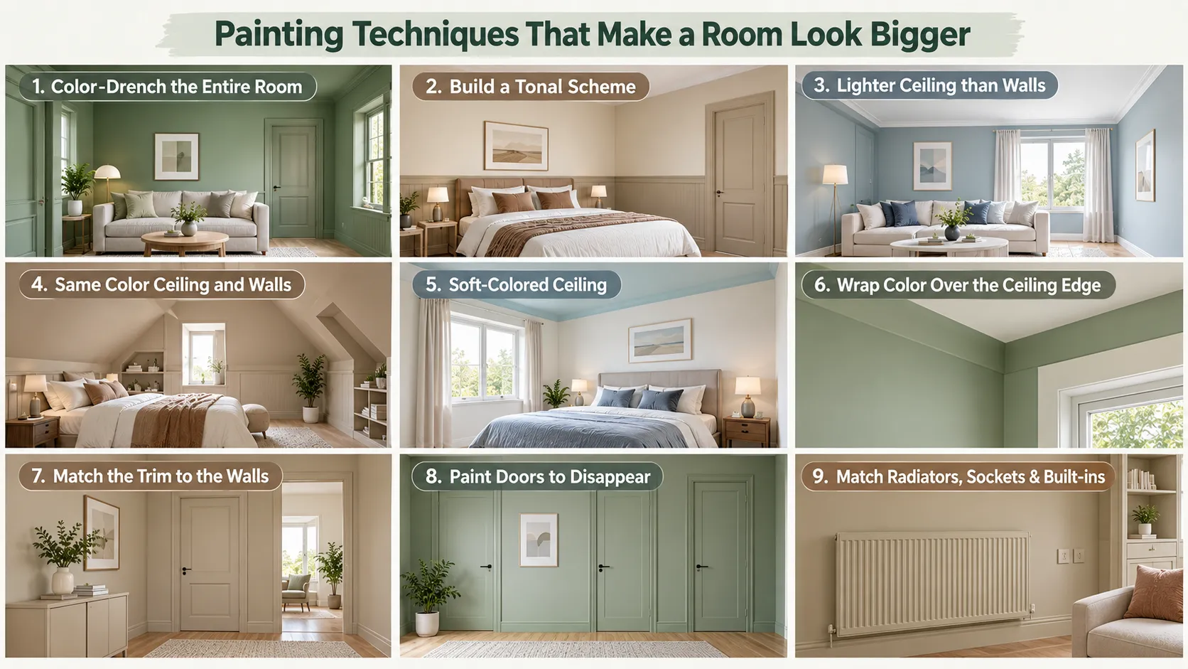
1. Color-Drench the Entire Room
Color drenching means painting walls, ceiling, skirting boards, doors, and window frames in one shade. With no contrast to catch the eye, the boundaries of the room almost vanish. The result feels calm, deliberate, and noticeably larger.
Drenching works with pale and deep colors alike. Use one color in different finishes, such as matt on walls and eggshell on woodwork, to add subtle variety.
2. Build a Tonal Scheme with One Color Family
If a full drench feels too bold, use three or four shades from the same color strip. Put the mid-tone on the walls, the palest shade on the ceiling, and a slightly deeper tone on the woodwork. The room keeps some definition, yet the transitions feel smooth and gentle.
3. Paint the Ceiling Lighter Than the Walls
A ceiling one or two steps lighter than the walls appears higher and more open. Many paint charts offer the same color at reduced strength, such as a quarter or half strength. This keeps the undertone consistent, so the ceiling looks connected rather than stuck on.
4. Paint the Ceiling the Same Color as the Walls
In rooms with sloping ceilings, beams, or awkward angles, one continuous color hides the lines. Your eye cannot find the point where the wall stops and the ceiling starts. Attic bedrooms and loft conversions benefit most from this approach.
5. Try a Soft-Colored Ceiling as a “Fifth Wall”
A very pale blue, blush, or sage ceiling can feel like an open sky above you. This idea has a long history in American porch ceilings, where pale blue suggested daylight. Keep the color light and gentle, or it will press down on the room.
6. Wrap the Color Over the Ceiling Edge
Carry the wall color 15 to 30 centimeters onto the ceiling before switching to the ceiling color. This blurs the joint and makes the walls look taller. It works especially well in rooms without cornicing or crown molding.
7. Match the Trim to the Walls
Bright white skirting, architraves, and window frames outline every edge of a small room. Painting the trim in the wall color removes those lines and makes the walls read as one clean surface. Use a durable eggshell or satin on the woodwork for easy cleaning.
8. Paint Doors to Disappear
A small room with several doors can feel chopped up and busy. Paint each door and its frame in the wall color, so they sink into the background. The walls then look longer and more continuous.
9. Paint Radiators, Sockets, and Built-ins the Same Color
Radiators, pipes, and fitted cupboards interrupt the eye when they contrast with the wall. Paint them to match, using heat-resistant paint on radiators. Built-in wardrobes and shelving painted in the wall color feel like part of the architecture rather than bulky furniture.
10. Paint the Far Wall a Slightly Deeper Shade to Add Depth
In a square room, a gently deeper tone on the wall opposite the door creates a sense of depth. Keep the step small, just one or two shades darker. A strong contrast will shorten the room instead of stretching it.
11. Widen a Narrow Room With the End Walls
Long, narrow rooms and corridors feel like tunnels. Paint the two short end walls a warmer or deeper shade than the long side walls. The end walls then appear to advance, which balances the room’s proportions and makes it feel wider.
12. Use Color Blocking to Redraw the Room’s Shape
Color blocking uses bold shapes of paint to mark zones or change proportions. A painted arch behind a bed or desk adds a sense of height and a clear focal point. A block of color that runs up the wall and across the ceiling can also stretch the eye upwards.
13. Paint Vertical Stripes to Lift a Low Ceiling
Vertical stripes draw the eye upwards and make low ceilings seem higher. Use tonal stripes, such as matt and gloss in the same color, for a subtle and elegant finish. Wider stripes look calmer in small rooms than narrow, busy ones.
14. Paint Horizontal Stripes to Widen a Room
Horizontal stripes pull the eye sideways and make narrow walls appear wider. Keep them in soft, close tones to avoid a heavy or busy result. This trick suits long hallways and small children’s rooms.
15. Raise the Dado or Wainscot Line
Traditional paneling sits at about one-third of the wall height. Raising the division to two-thirds or three-quarters of the wall makes the ceiling appear higher. Paint the lower section a slightly deeper tone and the upper section a paler shade for extra lift.
16. Paint a Half-Wall in a Tone of the Main Colors
A painted lower band, stopping at a consistent height, gives structure without clutter. Use a shade from the same family as the upper wall to keep the scheme soft. This approach suits hallways, kitchens, and children’s rooms, where the lower wall takes knocks.
17. Paint the Floor a Pale Color
Painted floorboards in a light, soft shade bounce light upwards and brighten the whole room. The lines of the boards also draw the eye along the room’s length. Use a dedicated floor paint and choose a tone that relates to the walls.
18. Paint Diagonal Floor Stripes or a Checkerboard
A pale diagonal pattern on the floor pushes the eye towards the corners and makes a small floor feel larger. Keep the contrast gentle, such as two neighboring neutrals. Strong black-and-white patterns can overwhelm a tiny room.
19. Blend Alcoves, Nooks, and Window Reveals
Paint alcoves, dormer windows, and window reveals in a pale shade to catch and reflect daylight. Light bounces off these angled surfaces and spreads further into the room. As a result, the whole space feels brighter and more open.
20. Connect Adjoining Rooms with a Shared Color
When you can see one room from another, a shared color makes them read as one larger space. Use the same shade, or tones of it, across open-plan zones and connected hallways. Sudden color changes at every doorway make each room feel smaller and separate.
Choosing the Right Paint Finish and Sheen
Sheen controls how much light a surface reflects, so it shapes the sense of space as much as color does. Higher sheen bounces more light, but it also shows every dent and roller mark.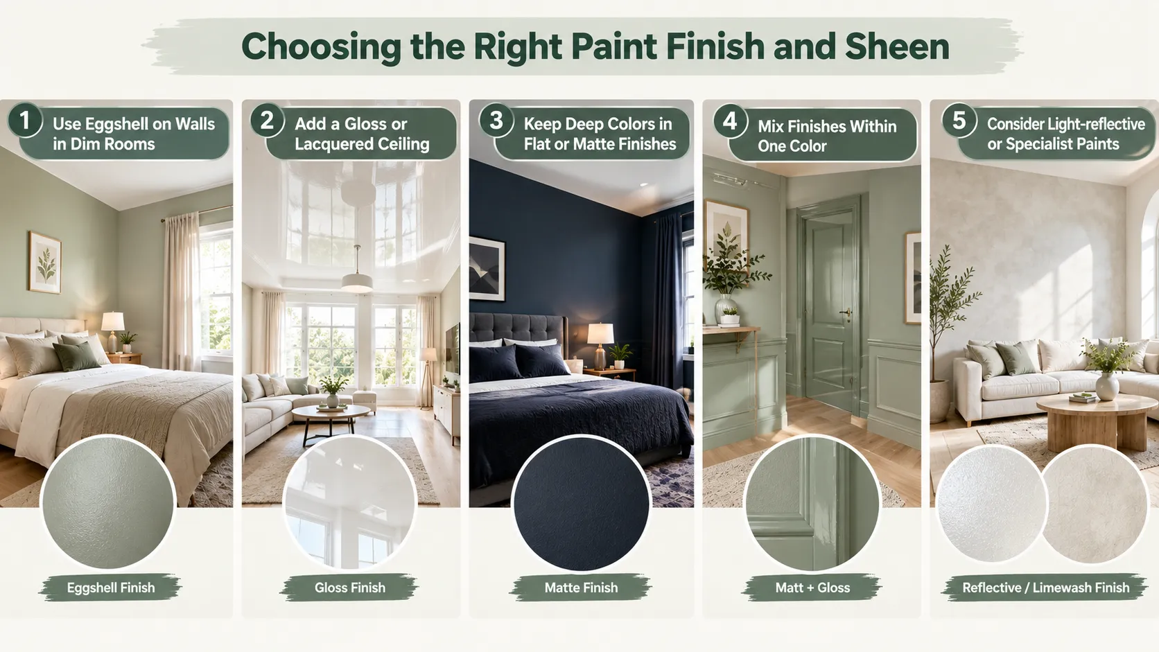
1. Use Eggshell on Walls in Dim Rooms
A low-sheen eggshell reflects more light than matt without looking shiny. It suits small rooms with limited daylight and surfaces that need regular wiping. Prepare the walls well, because eggshell highlights uneven plaster.
2. Add a Gloss or Lacquered Ceiling
A high-gloss ceiling works almost like a mirror above your head. It reflects light and the room below, which creates a strong sense of height. This technique needs a perfectly smooth ceiling and professional-level preparation to succeed.
3. Keep Deep Colors in Flat or Matte Finishes
Dark colors in a matte finish absorb light evenly and hide corners, which creates depth. In a shiny finish, the same color reflects glare and exposes every imperfection. Use matt on the walls and a satin finish on the woodwork for a refined contrast.
4. Mix Finishes Within One Color
One color in two finishes adds texture and interest without breaking the space. Try matt walls with gloss trim, or matt and gloss stripes in the same shade. The room stays unified, yet light plays across the surfaces in a subtle way.
5. Consider Light-reflective or Specialist Paints
Some brands sell paints with added reflective particles that bounce more light than standard emulsion. Others offer chalky or limewash finishes that create a soft, cloudy movement across the wall. Limewash, in particular, gives pale walls an airy, weathered depth that makes small rooms feel open.
Why Paint Changes How Big a Room Feels
Paint cannot move a wall, but it changes how your brain reads distance, edges, and light. Once you understand these three signals, every color choice becomes easier and far less of a gamble.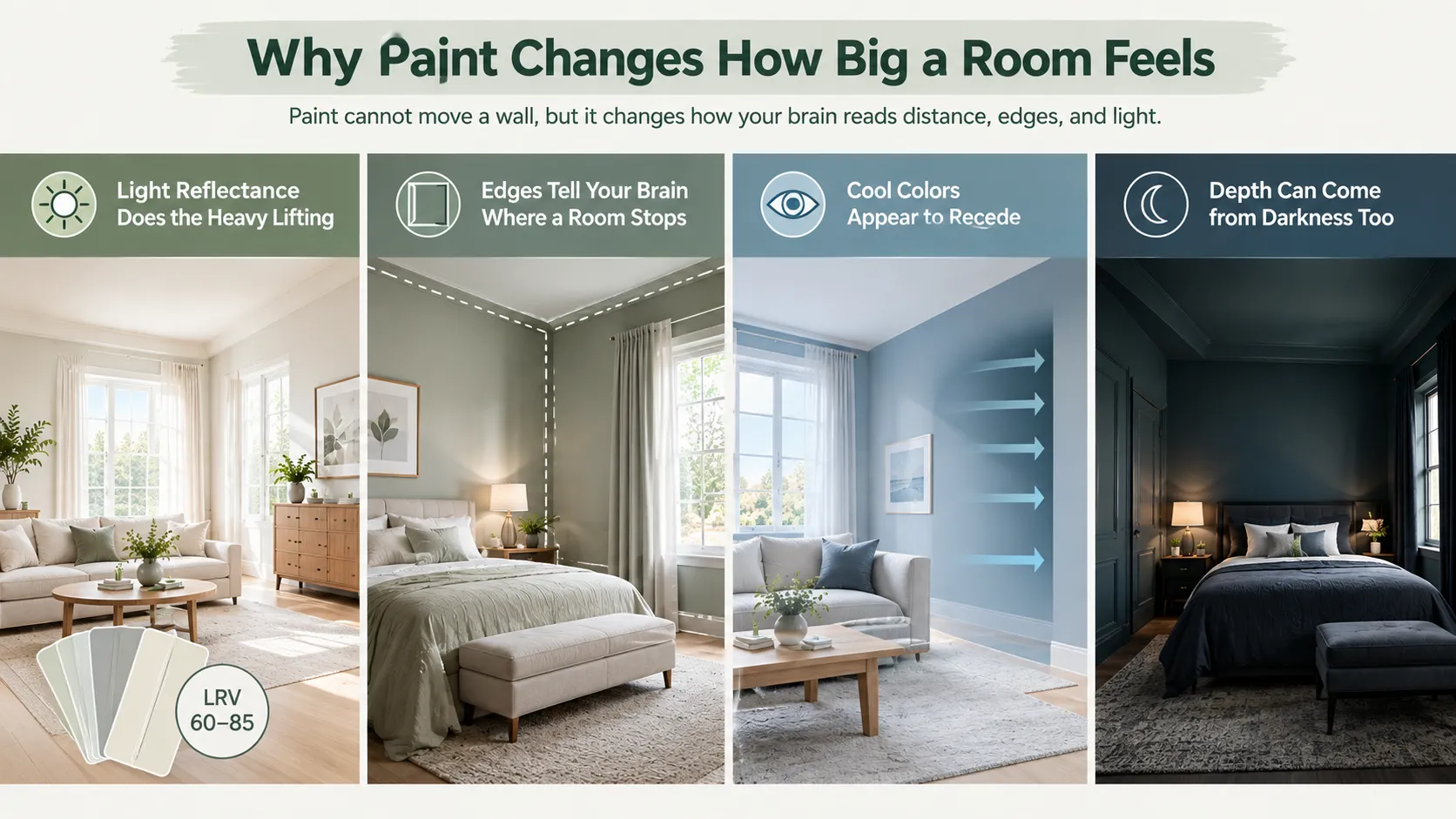
Light Reflectance Does the Heavy Lifting
Every paint color carries a Light Reflectance Value, usually printed on the back of the swatch or listed on the brand’s website. The scale runs from 0 for pure black to 100 for a theoretical perfect white. A color with an LRV of 75 bounces roughly three-quarters of the light that hits it back into the room.
Higher reflectance spreads light into corners and softens shadows. When corners stay bright, your eye cannot pinpoint where the walls meet, so the room reads as larger. As a working rule, choose wall colors between 60 and 85 for small rooms. Anything above 90 can feel stark and clinical under strong daylight.
Edges Tell Your Brain Where a Room Stops
Your eye measures a room by tracking its boundaries. Sharp contrast between a wall and the ceiling, or between a wall and white trim, draws a bright line around the space. That line acts like a frame and makes the room feel contained.
When you reduce contrast, the boundaries soften, and the eye keeps traveling. This principle explains why tonal schemes and color drenching work so well. It also explains why a single dark accent wall can sometimes shrink a room instead of enlarging it.
Cool Colors Appear to Recede
Painters and landscape artists have used aerial perspective for centuries. Distant hills look bluer and paler than nearby objects because the atmosphere scatters light. Your brain has learned to link cool, soft colors with distance.
Indoors, the same trick applies. Muted blues, blue-greens, and cool greys seem to sit further away than they really are. Warm, saturated reds and oranges do the opposite and appear to advance towards you.
Depth Can Come from Darkness Too
Very deep colors absorb light and hide the corners altogether. In a room with little daylight, a dark, all-over scheme can make the walls seem to dissolve. The effect feels less like a box and more like an open, endless space. This approach only works when you commit fully, which later sections explain in detail.
Room-by-Room Paint Ideas for a Bigger Look
Each room brings its own light, furniture, and daily use. Tailor the techniques above to the space you plan to paint.
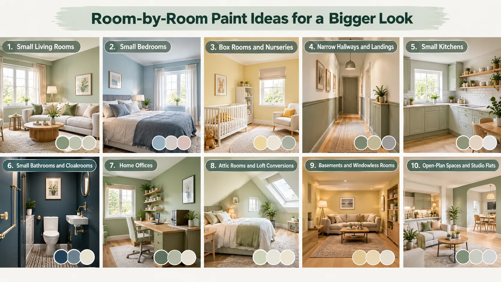
Small Living Rooms
Choose a soft neutral or pale green on the walls and carry it across the trim. Paint the ceiling a quarter-strength version of the wall color to add height. If the room gets little daylight and you use it mostly in the evening, consider a deep, cozy drench instead.
Small Bedrooms
Calm blues, soft sage, and plaster pinks help a small bedroom feel restful and open. Paint the wall behind the bed in a slightly deeper tone to create depth without a harsh contrast. For a sloped ceiling, run one color over the walls and ceiling to hide awkward angles.
Box Rooms and Nurseries
Pale yellows and warm whites lift box rooms that face north or sit at the back of the house. Paint built-in storage in the wall color so it blends away. A painted arch or soft color block can mark a play or reading zone without clutter.
Narrow Hallways and Landings
Hallways suffer from little light and plenty of scuffs. Use a pale eggshell on the upper walls and a deeper, durable tone on the lower third. Paint the end wall slightly warmer to make the corridor feel shorter and wider.
Small Kitchens
Paint cabinets and walls in close tones, so the units recede rather than dominate. Satin or eggshell finishes bounce light and wipe clean easily. Pale cabinets in a light kitchen reflect more light, while deep cabinets can suit a larger, brighter kitchen.
Small Bathrooms and Cloakrooms
Bathrooms suit bolder choices, because people spend short bursts of time there. A full drench in deep blue or green can make a tiny cloakroom feel like a jewel box. For a bright look, choose a soft white or pale aqua in a moisture-resistant satin finish.
Home Offices
Soft greens and muted blues support focus and make a small office feel less boxed in. Keep the wall behind your desk plain and calm, since you may appear on video calls. Paint shelving in the wall color so books and files become the main feature.
Attic Rooms and Loft Conversions
Sloped ceilings and dormers create many edges and shadows. Paint walls and ceiling in one light color to smooth out the angles. Use a pale shade in the dormer reveals, so each window throws as much light as possible into the room.
Basements and Windowless Rooms
Choose warm whites or soft cream-yellows to counter the cold, flat light of bulbs. Alternatively, embrace the darkness with a rich drench and layered warm lighting. Either way, avoid mid-tone greys, which often look dull and heavy underground.
Open-Plan Spaces and Studio Flats
Use one base color throughout to make the whole flat feel connected and generous. Define zones with tonal color blocks, painted arches, or a deeper shade on one side. Avoid a different bold color for every area, as this breaks the space into small pieces.
Common Paint Mistakes That Make Rooms Look Smaller
Even good colors can backfire when you place them badly. Watch out for these frequent errors before you open the tin.
- Choosing brilliant white for a dark room. Stark white turns grey and flat without strong daylight. A warmer white usually looks brighter in practice.
- Painting one dark accent wall in a tiny room. A lone dark wall often reads as a heavy block and shortens the space. Commit to a full drench or keep the contrast gentle.
- Using high contrast between walls and trim. Bright white trim against coloured walls outlines every edge. Match the trim, or choose a shade from the same family.
- Ignoring undertones. A beige with a pink undertone can clash with cool flooring and make the room feel smaller. Compare swatches against your floor, furniture, and fabrics.
- Picking mid-tone greys for north-facing rooms. Cool light drains grey and leaves the room looking dull. Choose a warmer neutral or a color with a green or beige base.
- Painting the ceiling a much darker color than the walls. A heavy ceiling lowers the room visually. Keep dark ceilings for tall rooms or full drenches only.
- Using too many colors. Several strong shades in one small room chop it into sections. Stick to one family, plus one gentle accent at most.
- Skipping sample tests. A color on a tiny chip rarely looks the same on a full wall. Always test large patches in real light.
- Choosing high gloss on poor walls. Shiny finishes reveal cracks, dents, and patchy filler. Prepare surfaces thoroughly or pick a lower sheen.
- Forgetting the lighting. Warm and cool bulbs change paint colors dramatically. Check samples under your actual bulbs in the evening.
Final Thoughts
Paint gives you the most affordable way to make a room look bigger, and the results can feel dramatic. Focus on three principles: reflect more light, soften the edges, and keep the scheme connected. Whether you choose a gentle white, a calm sage, or a bold navy drench, commitment and careful testing matter more than any single color.
Start with one room, test your samples in real light, and let the space guide your choices. With the right color in the right place, even the smallest room can feel open, bright, and welcoming.
Frequently Asked Questions
What color makes a small room look bigger?
Soft whites, pale neutrals, light blues, and gentle greens make small rooms look bigger in most homes. These shades reflect plenty of light and appear to recede. In rooms with very little daylight, a deep all-over color can also create a sense of endless depth.
Should the ceiling be lighter or darker than the walls?
In most small rooms, paint the ceiling lighter than the walls or in the same color. A lighter ceiling feels higher, while a matching ceiling hides awkward angles. Save darker ceilings for tall rooms or full color drenches.
Do dark colors always make a room look smaller?
No, dark colors do not always shrink a room. A dark color used on every surface blurs the corners and makes the edges hard to read. Problems arise when one dark wall contrasts sharply with white surroundings.
Is white or grey better for a small room?
Warm, soft white usually beats grey in small rooms, especially those with limited daylight. Grey can look sleek in bright, south-facing spaces. Always choose a grey with a visible undertone, so it avoids a flat, lifeless look.
Which paint finish makes a room look bigger?
Eggshell and satin finishes reflect more light than matt, which helps a room feel brighter and larger. Use them on walls in dim rooms and on woodwork elsewhere. Keep ceilings flat to hide imperfections, unless you plan a polished gloss ceiling.
Should the trim be white in a small room?
White trim can outline a room and make it feel smaller when the walls are coloured. Painting trim in the wall color, or a shade from the same family, creates a smoother, larger look. Crisp white trim still works well when the walls are also a soft white.
Can paint make a low ceiling look higher?
Yes, paint can make a low ceiling look higher. Use a lighter ceiling, wrap the wall color slightly onto the ceiling, or paint vertical stripes. Raising the height of any paneling or color division also lifts the eye.
How do I make a narrow room look wider with paint?
Paint the short end walls in a warmer or slightly deeper shade than the long walls. The end walls appear closer, which balances the room’s proportions. Soft horizontal stripes on the long walls can widen the space further.
What is color drenching, and does it work in small rooms?
Color drenching means painting walls, ceiling, trim, and doors in one color. It works very well in small rooms because it removes the lines that define the room’s size. You can drench in pale or deep shades, depending on your light and style.