
25 Best Paint Colors for Living Room Designs That Never Go Out of Style

The best paint colors for a living room can make your space feel brighter, more spacious, warmer, or more inviting. Popular choices include warm white, beige, greige, soft gray, sage green, navy blue, and earthy terracotta. Each shade creates a different effect depending on your room’s natural light, wall size, furniture, and flooring. Light neutrals work well in smaller living rooms, while deeper colors add contrast and character to larger spaces.
In this guide by Floor Land, we organize 25 proven shades into five clear families. Each pick includes its undertone, its approximate Light Reflectance Value (LRV), the rooms it suits best, and the colors that pair well with it. Whether you live in a sun-filled apartment or a north-facing family home, you will find a shade here that fits your space and your style.
Warm Whites & Soft Neutrals
Whites are the most popular paint color for warm interiors. While they are not as white as the gallery whites, they do have a touch of cream or beige to make the room feel more lived-in than clinical. They blend in with any decor style and allow you to replace cushions, art, and custom carpets over the years.
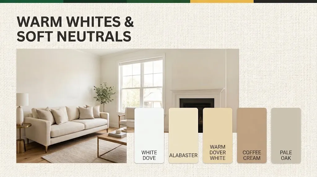
1. White Dove (Benjamin Moore OC-17)
White Dove is a soft, slightly gray-softened warmth that will never turn yellow. Because it performs on walls, ceilings, and trim simultaneously, designers can count on it for the seamless, gallery-like effect it provides. It is bright enough to light up dark rooms, but not bright enough to hurt the eyes in sunny rooms, with an LRV rating of approximately 83. This wall paint complements natural oak flooring, brushed brass fittings, and linen upholstery.
2. Alabaster (Sherwin-Williams SW 7008)
Alabaster is a creamy, cozy white with a subtle beige undertone. It will complement contemporary design and traditional moldings alike. With an LRV of 82, it suits a north-facing living room where a warm lift is desired. Combine with walnut custom furniture, terracotta pots, and cognac leather for a casual, layered style.
3. Dover White (Sherwin-Williams SW 6385)
Dover White is warmer and more golden than Alabaster. It’s a good choice to brighten dark rooms, and it works well in rooms with fewer windows. Choose it when your furniture style leans rustic or farmhouse. It will look great with sage green accents, woven baskets, and black iron hardware.
4. Swiss Coffee (Benjamin Moore OC-45)
Darker shades of coffee, like Swiss Coffee (Benjamin Moore OC-45), are also a popular choice.
Swiss Coffee is a dense and creamy white of an orange/beige hue. It reads as a pure white during the day and a velvety cream at night. This dual use makes it great for your living room, with lots of traffic in the afternoon and relaxation at night. Pair it with warm wood, cream boucle, and amber-colored lighting fixtures.
5. Pale Oak (Benjamin Moore OC-20)
Pale Oak is near the edge of off-white/light greige. It has a slight pink-taupe warmth with no color. It has an LRV of about 69, so it has more presence than white but still feels airy. Complement with crisp white trims, light gray sofas, and light blush accents.
Greiges, Taupes, and Earthy Mid-Tones
The color palette of greige is a combination of gray and beige that results in a neutral shade that is both contemporary and inviting. These mid-tone colors bring a splash of color to your walls, but aren’t so dark that they’re completely inflexible to a change in furniture. They also camouflage scuffs and fingerprints better than bright whites, which comes in handy in hectic family areas.
6. Revere Pewter (Benjamin Moore HC-172
Revere Pewter is one of the most reliable living room shades in the last 20 years. The warm greige base has an LRV of approximately 55, which works well for nearly any light direction. It seamlessly connects classic and modern spaces. Combine with white trim, charcoal accents, and natural jute rugs and sisal carpets.
7. Agreeable Gray (Sherwin-Williams SW 7029)
As the name suggests, Agreeable Gray is easy to get along with for almost all floors and fabrics. It has a lighter and slightly cooler feel than Revere Pewter, with an LRV of 59. This will work well in an open-plan house with a living room that leads to the kitchen. Complement with navy cushions, light oak, and chrome or nickel finishes.
8. Accessible Beige (Sherwin-Williams SW 7036)
Accessible Beige restores the feel of traditional beige, but without its 80s-era yellow tint. A hint of grey keeps it fresh and can help to soften hectic areas with green overtones. It shines in north-facing rooms, maintains its proportion in bright sunlight, and pairs well with cream sofas, olive plants, and bronze lighting.
9. Edgecomb Gray (Benjamin Moore HC-173)
Edgecomb Gray is a light, airy greige with a more beige than gray color. It is slightly warm and illuminates a room with an LRV of about 63. It works well in coastal, transitional, and Japandi style living rooms. Combine it with whitewashed wood, rattan accents, and soft blue fabrics.
10. Anonymous (Sherwin-Williams SW 7046)
Anonymous is a neutral tone rich in brown and gray. Sherwin-Williams mentions it for its ability to make a cozy, inviting atmosphere, suggesting that it is best used in a super lit room, or on a feature wall behind a sofa or media unit. It adds a lodge-like comfort due to its earthy depth. Combine it with cream upholstery, warm leather, and brass accents.
Calming Blues and Grays
Blue and gray have always been associated with calm, clarity, and order. These colors are muted to reduce visual distractions and help people relax at the end of the day. To ensure they last, choose subdued, slightly grayed blues instead of bright primary ones.
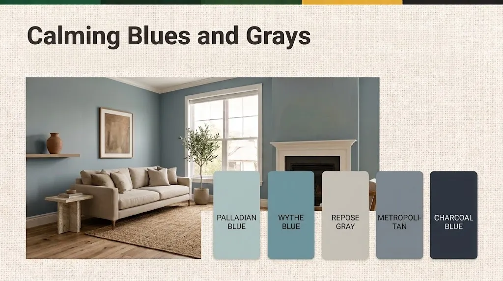
11. Palladian Blue (Benjamin Moore HC-144).
Palladian Blue is a light, airy shade of blue-green-gray. It feels like a clear sky through a sheer curtain. This shade suits rooms facing south and west, where light warms it up and creates a pleasing effect. Complement with white slipcovers, driftwood hues, and natural linen.
12. Wythe Blue (Benjamin Moore HC-143)
Wythe Blue is one step darker than Palladian Blue and has a stronger teal-gray tone. It provides an eye-catching color without sacrificing elegance and timelessness. Use it on all four walls in a brightly lit room or on one wall in a smaller room. Enhance with warm wood tones, cream trims, and antique brass.
13. Repose Gray (Sherwin-Williams SW 7015)
It has a warm undertone (but not too warm) with a true light gray from Repose Gray. Its LRV of nearly 58 is ideal for contemporary and minimalist decor featuring softer elements. It is tolerant of warm and cool lighting. Match with black accents, white oak, and textured gray or ivory throws.
14. Metropolitan (Benjamin Moore AF-690)
Metropolitan is a neutral, mid-tone grayish-blue. It looks sophisticated and urban, making it suitable for modern apartments. The shade is particularly refined next to marble, glass, and shiny metal. Combine with crisp white ceilings, velvet upholstery, and cool-toned art.
15. Charcoal Blue (Sherwin-Williams SW 2739)
Charcoal Blue is a deep, gray-toned navy that has a historic, library-like quality. Sherwin-Williams recommends it for a cool, calm living room look. Place it on a wall by the fireplace or on built-in shelving to make a statement but not overpower the room. Complement with warm whites, cognac leather, and gold picture frames.
Nature-Inspired Greens
Your living room leading to the outside is connected to the outside, and that’s a relationship that doesn’t go out of style. Muted shades of sage, olive, and gray-green are similar to neutrals but offer an added sense of life and personality. Other than that, they also blend with houseplants, wood, and stone, keeping the decor simple.
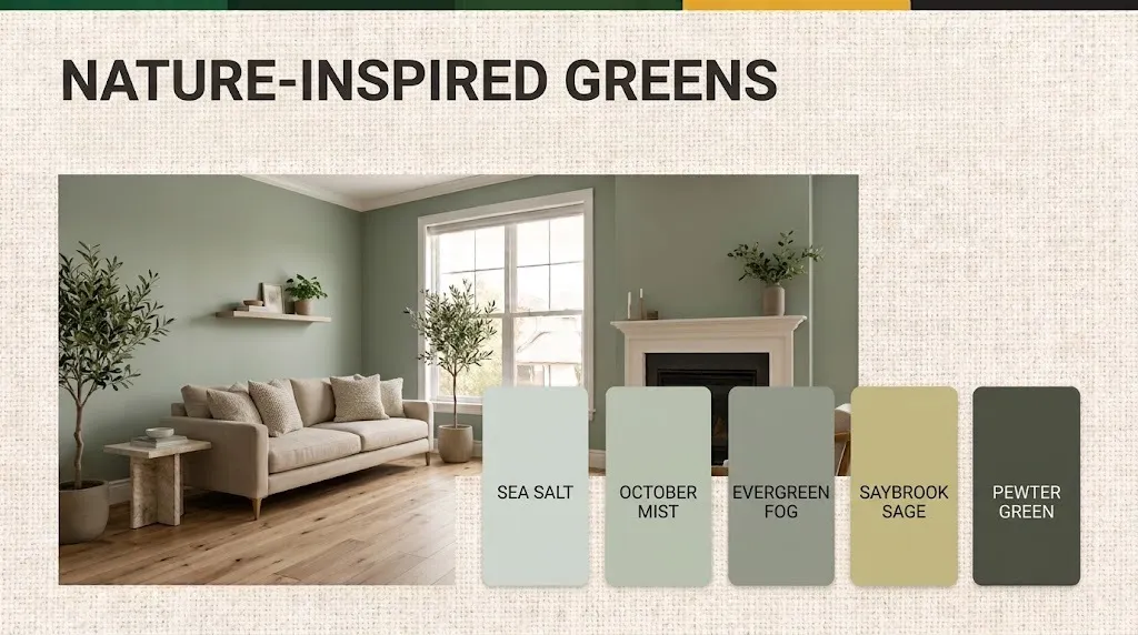
16. Sea Salt (Sherwin-Williams SW 6204)
Sea Salt is a soft green – gray – blue color that changes throughout the day. This ‘chameleon’ aspect helps to keep the room interesting while never becoming too loud. Its LRV maintains a bright and spa-like environment in the room. Combine with white oak, sand colored linen, and woven seagrass for a relaxing coastal vibe.
17. October Mist (Benjamin Moore 1495)
October Mist is a light sage that has a light gray base. According to Benjamin Moore, it’s one of the most popular living room paint choices. It is refreshing in the daylight and soothing at night. Mix with cream walls in neighboring rooms, terracotta accents, and light rattan.
18. Evergreen Fog (Sherwin-Williams SW 9130)
Evergreen Fog is a sophisticated, mid-tone with green, gray, and a subtle blue hue. It has the depth to support a large room, but it’s also soft on the eye. The shade is great for mid-century, Scandinavian, and modern organic design. Combine with walnut furniture, mustard cushions, and matte black lighting.
19. Benjamin Moore in Saybrook Sage
Saybrook Sage adds a more yellowish-green character and history to its green. It shines in rooms with ample daylight, and it doesn’t feel stuffy. The shade looks good in traditional, farmhouse, and cottage living rooms. Combine with creamy trims, floral fabrics, and rustic brass.
20. Pewter Green (Pewter by Sherwin-Williams, SW 6208)
Pewter Green is a dark, deep, earthy green with a hint of gray. It creates a cocooning effect in a library-ambiance living room. Use it on all walls in a large, bright room, or on paneling and built-ins in a smaller room. Make it a combination of warm whites, caramel leather, and lots of greenery.
Bold and Moody Statement Shades
Black and opulent hues prove that timeless doesn’t have to mean safe! Navy, bronze, black, clay, and red have been used in great interior spaces over the years. When used purposefully, they can transform a living room into a cozy, curated, and memorable space.
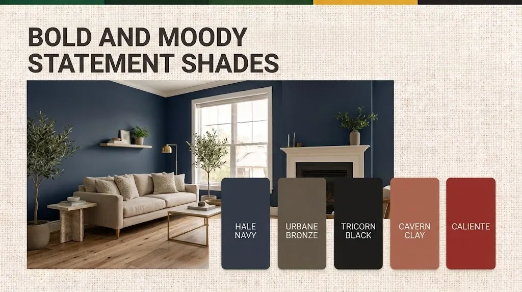
21. Hale Navy (Benjamin Moore HC-154)
A navy classic with a slight gray undertone, but it’s kind of a dark neutral navy. It complements white trim, wood floors, and metal accents equally. It has a low LRV of about 8, making it suitable for rooms with good light or for nighttime use. Complement it with crisp white, camel fabrics, and polished brass.
22. Urbane Bronze (Sherwin-Williams SW 7048)
Urbane Bronze is a warm, earthy brown-gray tone that is grounded and calming. Sherwin-Williams named it 2021’s Color of the Year, but its organic richness has kept it relevant beyond the 2021 season. It’s ideal for accent walls, fireplace surrounds, and cozy dens. Combine with cream linen, natural wood, and blackened steel.
23. Tricorn Black (Sherwin-Williams SW 6258)
Tricorn Black is a true black, rather than a blue or brown undertone. It brings art, shelving, and lighting to life on one wall. It also makes a great window frame, door, and fireplace mantle. Pair it with white walls, warm wood, and layered lighting to prevent it from being too heavy.
24. Cavern Clay (Sherwin-Williams SW 7701)
Cavern Clay is a soft, earthy sun-baked terracotta clay. It brings the beauty of Mediterranean and desert style into your living room. The shade is perfect for boho, Spanish, and modern rustic styles, especially on a single feature wall. Pair it with cream plaster, olive green plants, and natural jute.
25. Caliente (Benjamin Moore AF-290)
Caliente is a bold, rich red, and Benjamin Moore selected it as Color of the Year for 2024. Over the years, red has been the color of formal drawing rooms, and this shade isn’t overly vibrant. Add energy to one wall, to a reading nook or built-in shelving. Complement with warm whites, deep wood, and soft gold details.
How to Choose a Living Room Paint Color That Lasts
A timeless color isn’t simply a pretty chip; it is the right chip for the particular room. Prior to perusing the 25 shades listed above, run your space through the four filters below. They will prevent common, costly repaints.
Check Your Natural Light First
Window direction changes color for every color you put on the wall. Cool, indirect light is received in the north-facing rooms, which helps push grays into the blue range, making warm whites and creamy neutrals the better choices. Rooms facing south allow walls to be lit with warm light throughout the day, helping cooler hues of blue and green to look warm and inviting instead of cold. Eastern rooms light up in the morning and become dark in the evening, and vice versa with west-facing rooms.
Understand Light Reflectance Value (LRV)
LRV rates the amount of light reflected, from 0 (black) to 100 (white). This number tells you more about how a shade will react than any other mention will.
| LRV Range | What It Does in a Living Room | Best Suited For |
| 75 to 90 | Reflects most light and opens up the space | Small or dim rooms, open-plan layouts |
| 50 to 74 | Adds soft color while keeping the room bright | Most average-sized living rooms |
| 25 to 49 | Creates a cozy, enveloping mood | Well-lit rooms, reading corners |
| Below 25 | Delivers drama and depth | Accent walls, large rooms, evening spaces |
Identify the Undertone
All neutral colors have a tinge of yellow, pink, green, or blue. Press the paint chip onto a piece of plain white printer paper and uncover it. Then coordinate with the fixed elements (such as flooring, sofa fabric, stone, wood). A beige color (pink) next to a green marble floor (green) will never look right, regardless of the quality of the individual colors.
Pick the Right Finish
Sheen has an impact on appearance and durability. Matte and flat finishes cover imperfections in the wall and create a soft, chalky look. The most hygienic option for a number of family living rooms is Eggshell, which gives a subtle light. Eggshell is a safe option that gives a subtle light and is suitable for light cleaning, which makes it ideal for most family living rooms. Satin is suited for households with kids and pets due to its easy-to-clean nature. Use semi-gloss on trim, doors, and built-in shelving.
Always Test Before You Commit
Screens and printed chips have different color properties. Use two large swatches (at least 30cm x 30cm) on different walls, or peel-and-stick samples. See them in the morning, midday, and evening for 2-3 days under your bulbs to determine if they are active before purchasing full cans.
Expert Tips to Make Any Shade Look Timeless
If you aren’t sure how to make any shade look timeless, here are some expert tips to help you out. Use the right color when the surrounding details support it. Any of the 25 shades above will work beautifully with these professional skills.
- Follow the 60-30-10 rule. Use walls for about 60 percent of the color story, furniture for 30 percent, and accents for 10 percent.
- Coordinate with ceiling and trim.
- Choose bulbs carefully. Warm white bulbs (2700K – 3000K) will highlight the majority of neutrals, but cooler bulbs may make warm greiges look flat and gray.
- Connect open-plan spaces. Start by using the same color family (not necessarily the same color) in related rooms and then change the value (depth or lightness/darkness) of the colors.
- Use match codes, not names. These codes can easily be matched by most local paint suppliers in their top quality lines, and a test patch should always be compared to the original code.
Common Mistakes to Avoid While Choosing Paint Color for Living Room
Consider these common paint color choices and mistakes to avoid when selecting paint for your Living Room.
- Even the simplest color can be a disaster if the process doesn’t work. Steer clear of these frequent errors.
- Selecting a color without testing it on the wall from a phone screen or a small chip.
- Neglecting to account for undertones of elements like stone, tiles, and flooring.
- A flat finish on a high-traffic area such as a family room that should be wiped often.
- Using a very dark color for a small, low-light room without strong lighting to complement it.
- Not using primer between deep and light shades, resulting in a patchy finish.
Conclusion
The best paint colors for living room spaces are beautiful and functional. Use your light, consider the undertone, and select an LRV appropriate for your space. From soft white to earthy greige, blue to natural green to a striking statement shade, the 25 colors in this guide will help you get started. Try out two or three of your favorites on your own walls, live with them a couple of days, and choose the shade that works best in your space.
Frequently Asked Questions
What is the most timeless paint color for a living room?
Warm whites and balanced greiges, such as White Dove and Revere Pewter, remain the most timeless choices. They support changing decor and flatter most lighting conditions.
Which colors make a small living room look bigger?
Shades with an LRV above 70, such as Alabaster, Swiss Coffee, and Pale Oak, reflect more light and visually expand the walls. Painting trim and walls in the same tone also blurs edges and adds height.
Can dark colors work in a living room?
Yes. Deep shades like Hale Navy and Urbane Bronze create cozy, intimate spaces. Start with one accent wall if you feel unsure, and balance it with warm lighting and lighter furniture.
Do LRV numbers stay exactly the same across brands and stores?
The LRVs in this guide are approximate. Always confirm the current figure on the manufacturer’s color page, as matched or reformulated versions can vary slightly.
How long does a living room paint job typically last?
A quality interior paint in a living room usually looks fresh for about five to ten years, depending on traffic, sunlight, and cleaning habits.