
25 Small Bathroom Floor Tile Ideas to Make Your Space Look Bigger
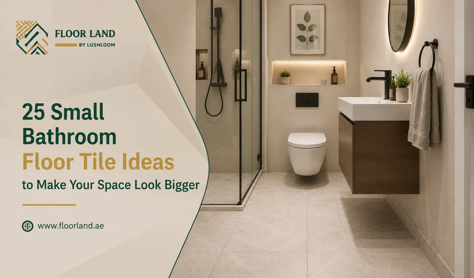
The best and fastest way to make a small bathroom floor look bigger is to use large-format tile (12×24 or larger) in a light, low-contrast tone. Grout the tiles in a color that nearly matches the tile, and run the tiles along the room’s longest sightline. Plus, minimal grout lines mean less interrupted visual flow, which makes your space feel open and spacious.
If you’re renovating a tiny powder room or updating a compact family bathroom, these floor tile ideas by Floor Land will help. By following these ideas, you can create a brighter, more open look while remaining practical for everyday use.
Top Tile Materials for Small Bathrooms
| Tile Material | Makes a Small Bathroom Look Bigger? | Why It Works | Best Choice For |
|---|---|---|---|
| Porcelain | Excellent | Large formats, minimal grout lines, many light finishes. | Most small bathrooms. |
| Ceramic | Very Good | Affordable and available in light colors. | Budget-friendly remodels. |
| Natural Stone | Good | Adds depth with subtle textures. | Luxury powder rooms. |
| Luxury Vinyl Tile (LVT) | Very Good | Seamless installation and realistic stone looks. | Rental or quick renovations. |
| Terrazzo Tile | Very Good | Light base reflects light and adds subtle texture. | Modern small bathrooms. |
| Marble-Look Porcelain | Excellent | Soft veining creates an open, elegant feel. | Bright, contemporary bathrooms. |
Large-Format Tile Ideas That Erase Grout Lines
Minimizing visible grout lines reduces visual disruption, creating the optical illusion of a larger, more expansive floor. The following five design concepts are built on this core principle.
1. 12×24 Porcelain Laid Along the Longest Wall
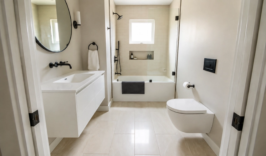
These large-format tiles are a more practical choice for bathrooms. A 12×24 tile covers a 5×8 bathroom in roughly 20 pieces instead of the 40 you’d need with 12×12s, halving the grout lines immediately.
Run the long dimension parallel to the longest wall, so the seams point away from the door rather than across it. In a typical 5×8 layout, that means running them from the door toward the tub.
2. 24×24 Rectified Tile With 1/16″ Joints
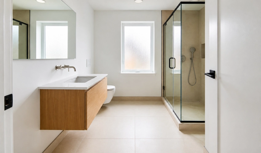
Rectified tile is mechanically cut after firing so every edge is dead straight, which lets you close the grout joint down to about 1/16 inch instead of the 3/16 inch a pressed-edge tile needs.
The visual difference is significant: a hairline seam almost disappears, especially with matched grout. In a 5×8 room, you might use only eight or nine tiles total.
Rectified tile is unforgiving of an uneven subfloor. Budget for self-leveling compound.
3. Slab-Look Porcelain for a Near-Seamless Floor
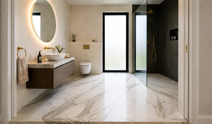
Large-format porcelain panels around 24×48, 32×32, or larger can cover a powder room floor in two or three pieces. With a book-matched or continuous-vein pattern, the floor reads as a single slab of stone. It’s the most dramatic space-expanding option available, and it removes nearly all grout maintenance from the equation.
4. Continuous Tile From Floor Into a Curbless Shower
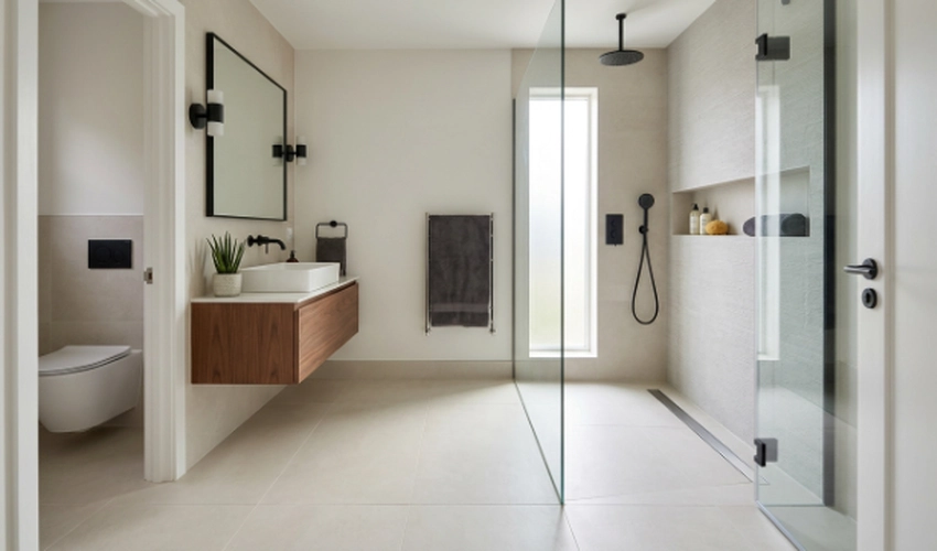
Every threshold, curb, and material change chops the floor into segments, and a segmented floor reads as small. Running one tile from the door straight into the shower removes the biggest visual break in the room.
Pair it with a linear drain rather than a center drain. A linear drain slopes in one direction only, which large-format tile can follow. A center drain requires a compound slope in four directions, and big tiles can’t bend to meet it.
5. Matching Floor and Wall Tile for a Monolithic Wrap
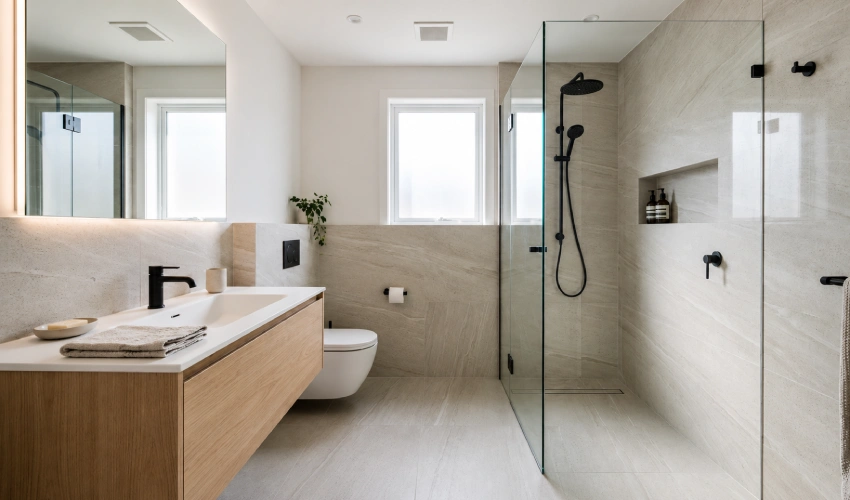
Using the same tile on the floor and the lower walls removes the corner line where floor meets wall. Without that hard boundary, the eye reads the room as one continuous volume rather than a box with a small base.
Keep the tone tight, and the finish varied. Use matte on the floor for grip, a lightly polished version of the same tile on the walls. So the effect stays cohesive without reading flat.
Best for: windowless powder rooms, where you want maximum light bounce.
Light and Reflective Tile Colors That Open Up the Room
Light tile returns more of the light hitting it, which lifts the perceived ceiling height and softens the corners. But “light” doesn’t have to mean “white and cold.”
6. Warm White Matte Porcelain
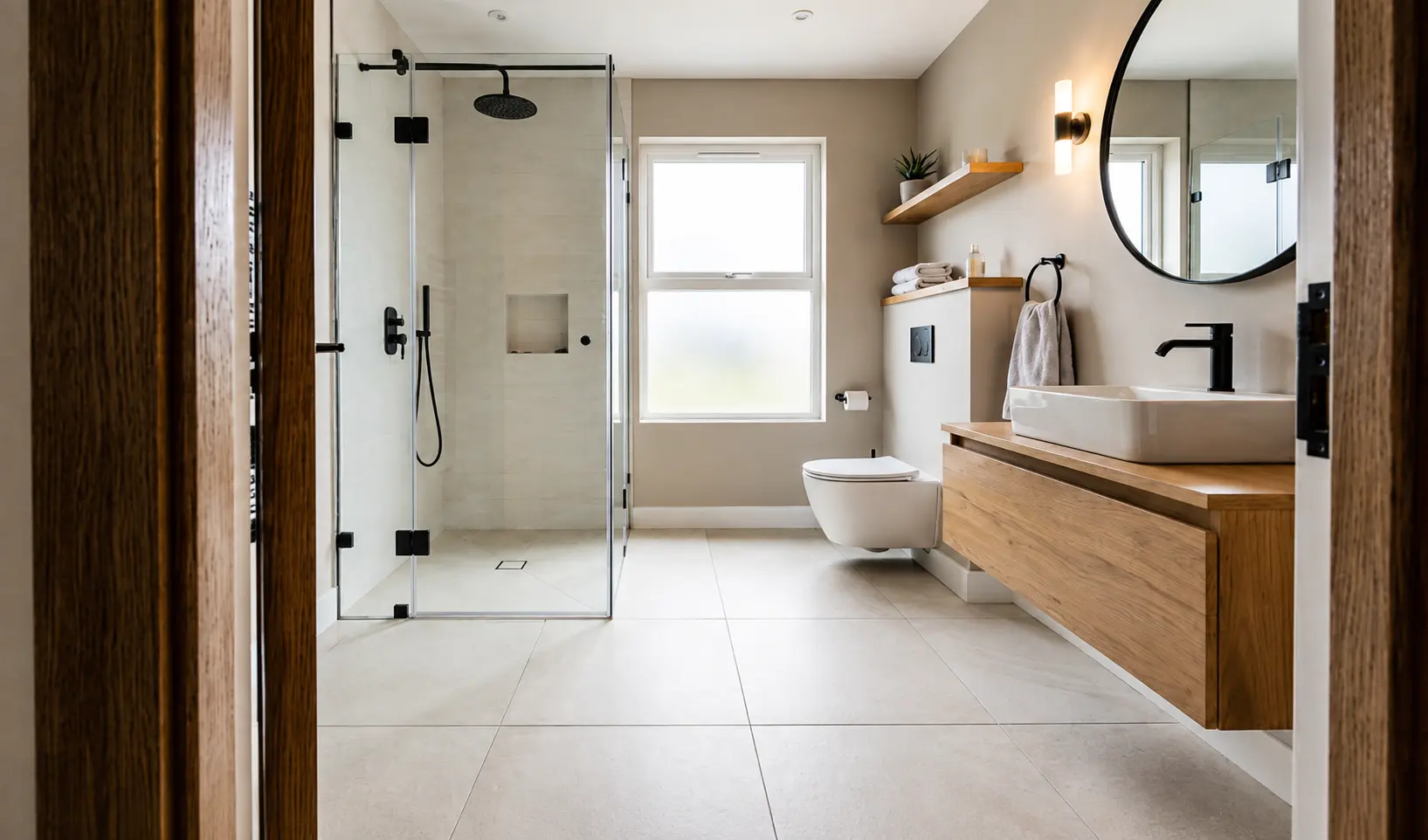
A warm white, one with a faint cream or greige undertone rather than a blue-grey one, bounces light without the clinical, gallery-floor feel of a pure white. Warm whites also hide the two things bathroom floors actually show: hard-water spots and dust. A cool white shows both.
Spec note: ask for a matte or honed finish with a published DCOF of 0.42 or higher. White gloss on a bathroom floor is a slip hazard, not a design choice.
7. Greige – The Safest Small-Bathroom Neutral
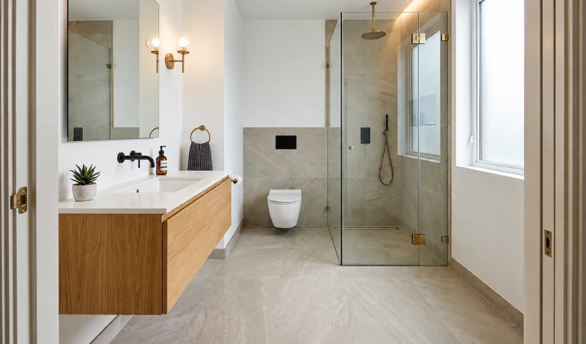
Greige sits between grey and beige, which means it coordinates with both warm fixtures (brass, oak, brushed bronze) and cool ones (chrome, matte black, white porcelain). In a small room where every element is visible at once, that flexibility matters. It’s also forgiving. A pure grey floor can pull cold and blue under LED lighting; greige holds its tone under almost any color temperature.
8. Pale Concrete-Look Tile
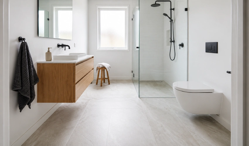
Concrete-look porcelain gives you a soft, cloudy surface with no repeating pattern and no directional grain. So the eye finds nothing to fixate on and simply moves across the floor. The subtle mottling is also the most practical surface on this list for hiding dust, hair, and footprints between cleans.
9. Light Marble-Look (Calacatta and Carrara)
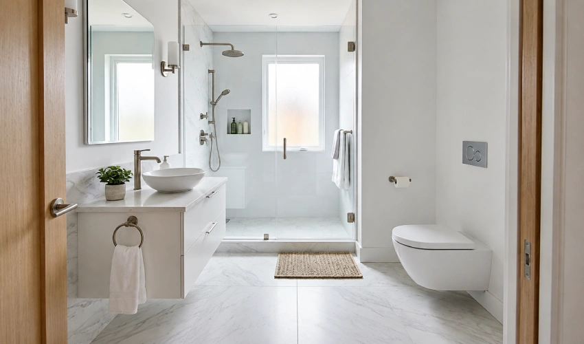
Marble-look porcelain gets you the brightness and depth of white stone without the sealing schedule and etching risk of the real thing.
In a small room, choose a tile with fine, low-contrast veining. Bold, high-contrast Calacatta veining is beautiful on a large floor and busy on a small one. Carrara’s softer grey feathering is the safer choice under 40 square feet.
10. Sand-Toned Limestone Look
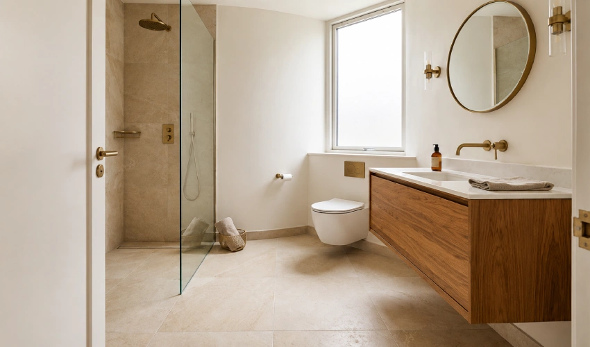
Limestone-look tile in a pale sand or bone tone brings warmth that greys can’t, and its very fine natural texture reads as soft underfoot without being visually noisy. It pairs particularly well with wood vanities and unlacquered brass. This is a combination that makes a small bathroom feel considered rather than merely bright.
11. Semi-Polished Tile for Windowless Bathrooms
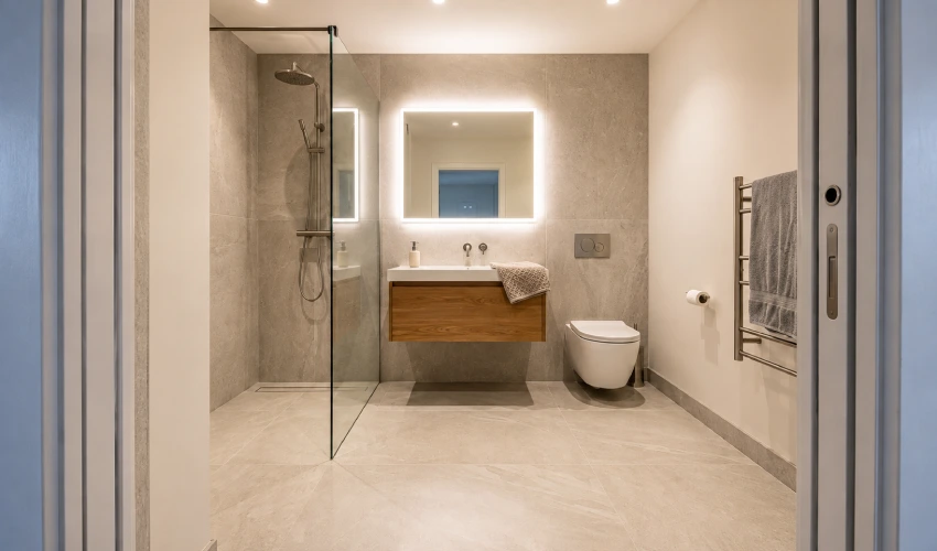
If your bathroom has no window, a fully matte floor absorbs the little light you have. A lappato (semi-polished) finish reflects light back up into the room without the mirror-slick surface of a full polish.
This is the one place where reflectivity on a floor is worth pursuing. Still check the DCOF rating. Some lappato finishes hold 0.42, and some don’t, and the difference isn’t visible to the eye.
Layout Patterns That Stretch the Floor Visually
Generally, the same tile offers different results. Layout controls the direction your eye travels the moment you open the door.
12. 45-Degree Diagonal Lay
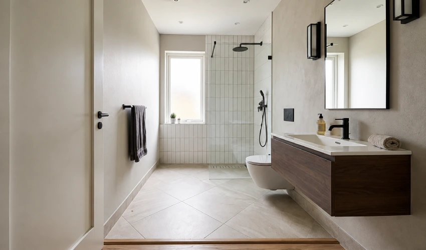
urn the grid 45 degrees; every seam points at the corners rather than the walls. The eye follows the longest available line, which in a diagonal layout is the room’s diagonal. Make sure to have a single longest dimension in any rectangular room. It’s the oldest trick in the tile trade, and it still works, particularly in near-square bathrooms where there’s no strong long axis to exploit.
Order 15% overage. Diagonal layouts generate significantly more offcut waste than a straight grid.
13. Running Bond in a Narrow Galley Bathroom
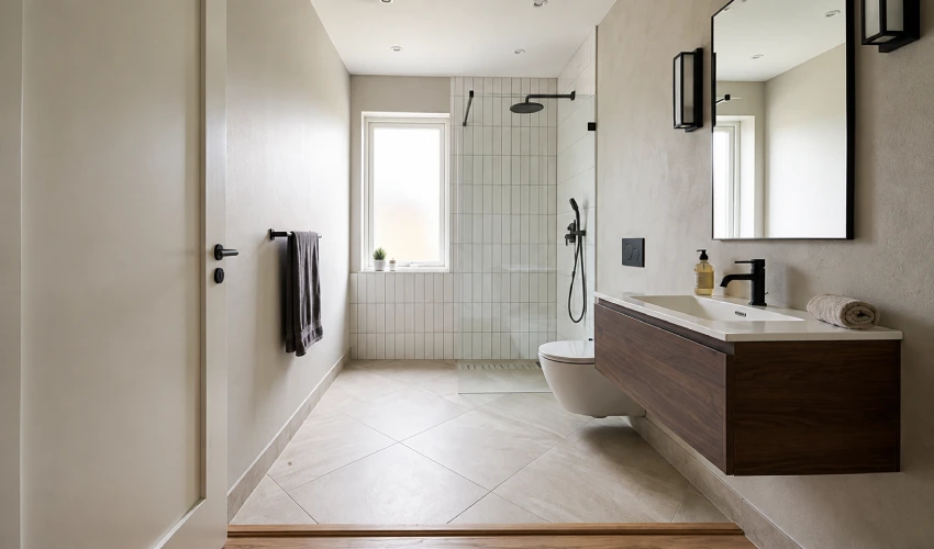
When you offset each row by a third (not a half; a 50% offset with long tile invites lippage), it creates a staggered horizontal rhythm that reads as width.
In a galley bathroom, a long, narrow door at one end runs the bond across the narrow dimension. The repeated horizontal lines widen a corridor the same way horizontal stripes widen a wall.
14. Tonal Herringbone
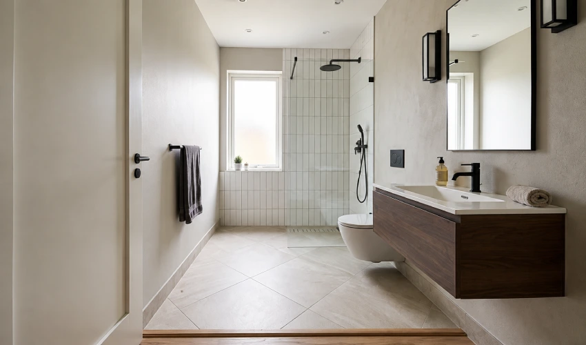
Herringbone has a reputation as a “busy” pattern, but that comes from high-contrast installations. In a single pale tone with matched grout, herringbone becomes texture rather than pattern. It adds movement and craft without adding visual noise.
Budget note: herringbone is labor-intensive and needs 15–20% overage. It’s the most expensive layout on this list to install.
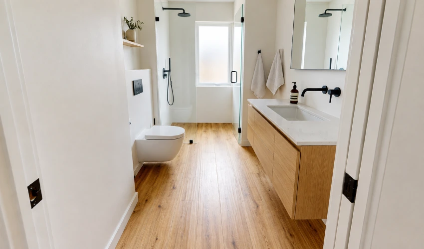
15. Plank-Format Wood-Look Tile Run Lengthwise
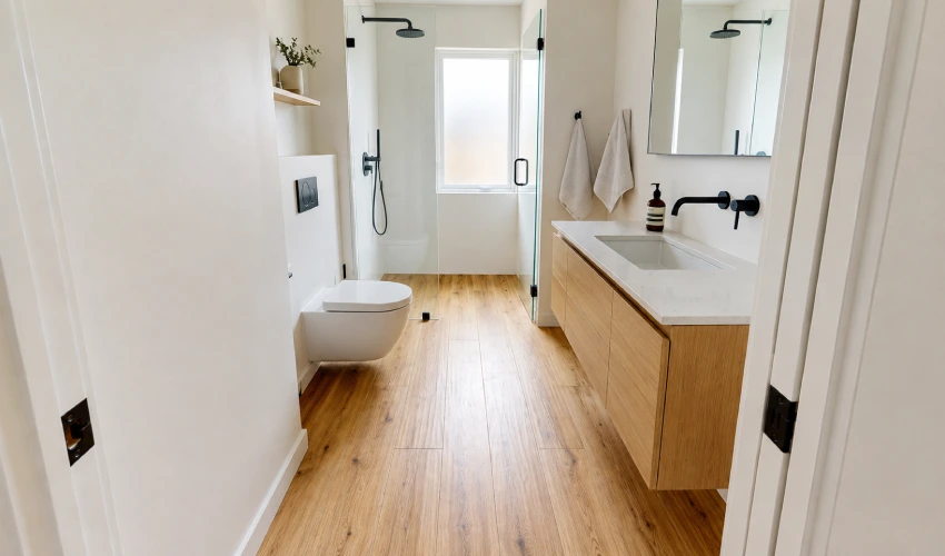
A 6×36 or 8×48 wood-look floor plank run along the room’s long axis creates the strongest directional pull available. The floor visually elongates in the direction the planks point.
Wood-look porcelain also brings warmth to a room that’s otherwise all hard, cold surfaces, and unlike real wood, it doesn’t care about standing water. This idea is best for long, narrow bathrooms and anywhere you want the bathroom to feel connected to adjacent wood flooring.
16. Oversized, Low-Contrast Checkerboard
Checkerboard is having a moment, and the small-bathroom version works when you change two variables: scale up and contrast down.
Use 12×12 or larger squares rather than the traditional 8×8, and pick two tones that sit close together. You can go with cream and pale greige, or bone and soft sage instead of black and white. You get the pattern’s charm without carving the floor into a dozen small visual units.
17. Straight-Set Grid Aligned to the Door Sightline
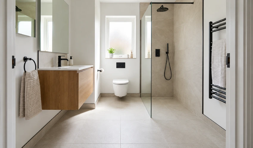
The simplest layout, done deliberately. Set the grid so the joints run away from the doorway rather than across it. Then start your first full tile at the most visible edge so the cut tiles land under the vanity or behind the door.
Most tile in small bathrooms is set to whatever’s convenient for the installer. Setting it to the sightline instead costs nothing and is the difference between a floor that looks planned and one that looks fitted.
Small-Format Tile Ideas That Still Feel Spacious
The “large tile only” rule is oversimplified. Small tile works in a small bathroom when the tile and grout are close in tone. Keep in mind that the pattern reads as texture, not as a grid.
18. Single-Tone Hexagon Mosaic
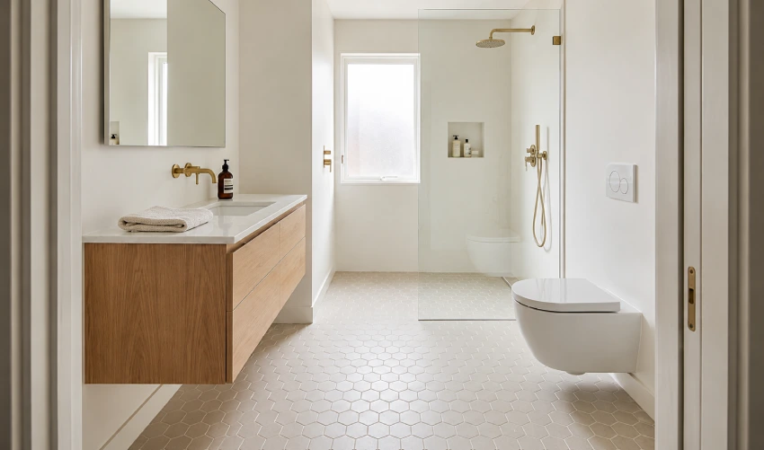
Hexagons have no straight continuous seam running wall to wall, which means the eye never finds a hard line to stop at. In one pale tone with a matched grout, a hex floor reads as a soft honeycomb texture.
They’re also excellent underfoot: all those grout joints deliver real slip resistance, and hexes conform to a sloped shower floor far better than any large tile.
19. Penny Round With Color-Matched Grout
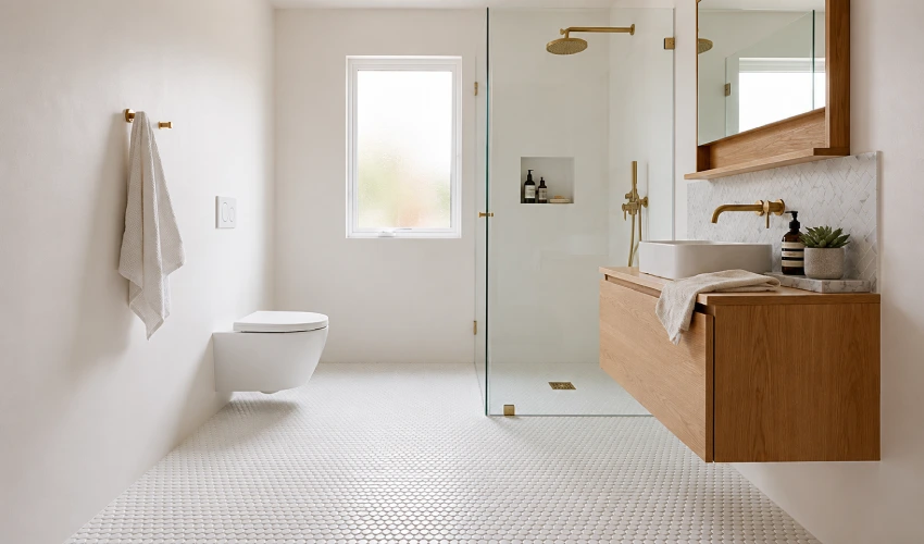
Penny rounds are the classic small-bathroom floor for good reason. The period-correct choice for pre-war homes and endlessly forgiving around awkward fixtures and old, out-of-square walls.
The critical detail is grout. White penny tile with dark grey grout gives you a dense polka-dot grid that shrinks the room. The same tile with white grout gives you a soft, dimpled, near-continuous surface. Same tile, opposite result.
20. Micro-Mosaic for Wet Room Floors
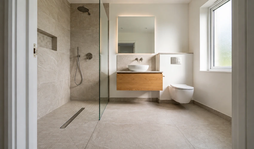
In a wet room or curbless shower, the floor has to slope in multiple directions toward a drain. Large tiles physically cannot do this without lippage or hollow spots. A 1×1 or 2×2 mosaic on a flexible sheet backing follows compound slope naturally.
Use the mosaic inside the wet zone and a large-format tile in the same tone outside it. You keep the seamless look where it’s visible and the technical performance where it’s needed. Also make sure to clean the shower tiles and grout regularly.
21. Fine-Aggregate Terrazzo Look
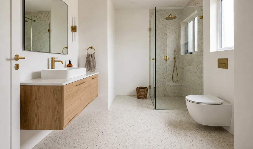
Terrazzo-look porcelain gives you a floor with visual interest and no directional pattern at all. Because the aggregate is distributed randomly, nothing about the surface tells the eye where the room’s edges are.
Choose a fine aggregate in tones close to the base color. Large, high-contrast chips create the same close-range busyness problem as bold marble veining.
Bold Small Bathroom Floor Ideas That Work Anyway
Almost every guide on this topic ends at “use light colors.” That’s safe advice, not complete advice. These four break the rule and hold up.
22. Dark Floor, Light Walls
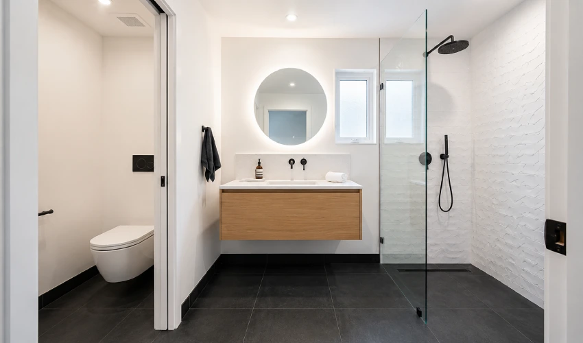
A dark floor under light walls doesn’t shrink a room; it grounds it. The floor recedes, the walls advance, and the eye is pushed upward, which reads as height.
This is the standard move in high-end small bathrooms and powder rooms, and it’s the opposite of what most tile blogs recommend.
Make it work: keep the walls genuinely light, use dark grout matched to the tile so the floor reads as one dark plane, and make sure you have adequate lighting. A dark floor in a dim room does shrink it.
23. Patterned Encaustic-Look “Tile Rug”
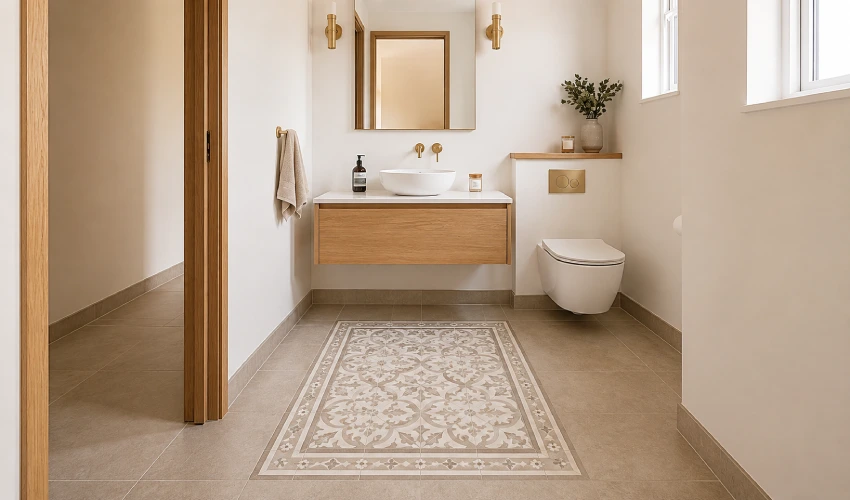
The bold pattern in a small bathroom works when it’s contained. Set a patterned encaustic-look tile as a defined rectangle in the center of the floor, bordered by a plain field tile in a matching tone.
The border does the work: it gives the pattern an edge, which stops it from fighting the walls. You get the personality of cement tile with none of the wall-to-wall chaos.
Best for: powder rooms, where you’re designing for impact rather than daily function.
24. Handmade Zellige-Look Texture in One Tone
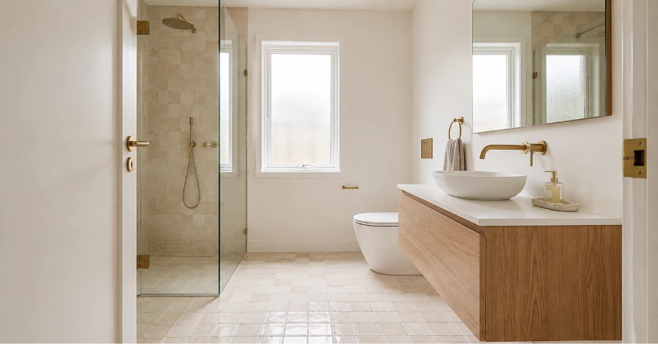
Zellige-look tile has an irregular, slightly undulating surface that catches light differently across every piece. In a single soft tone, the result is a floor with genuine depth and no pattern. The light does all the visual work.
Important caveat: true zellige is a wall tile. For floors, specify a porcelain zellige-look product rated for floor use with an appropriate DCOF. The handmade original is too soft and too slick for a bathroom floor.
25. Tile Skirting to Blur the Floor-to-Wall Line
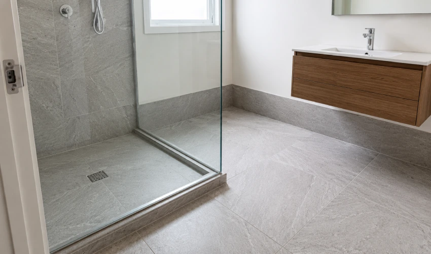
Run a 4–6 inch band of your floor tile up the wall in place of a painted wooden baseboard. The floor now appears to fold into the wall rather than stopping dead at it, and the room’s footprint reads as larger than it measures.
It’s also the more practical detail: a tiled skirting is waterproof, doesn’t swell, and eliminates the caulk line at the floor that goes grey within a year in every bathroom.
Grout Color and Width: The Detail That Decides Everything
You can get everything else right, but the wrong grout ruins the whole thing.
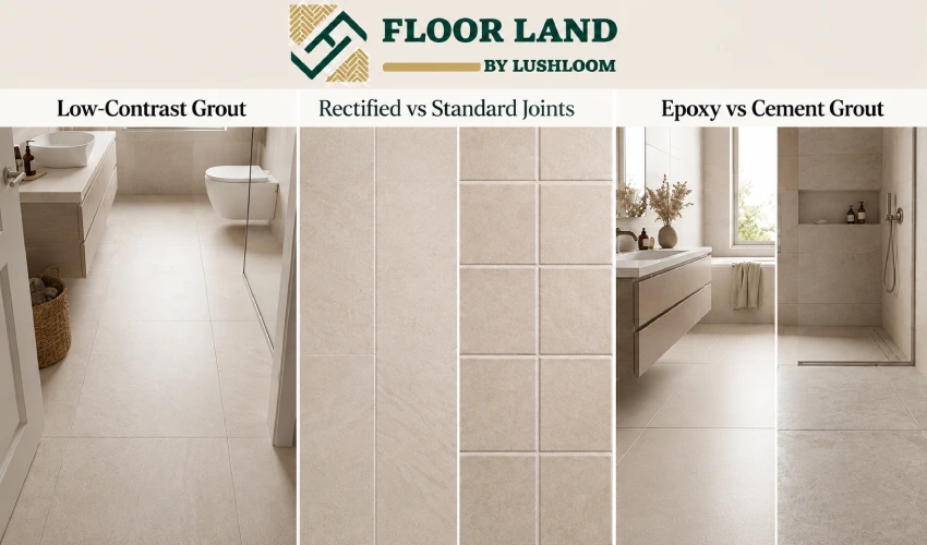
The Low-Contrast Rule
Match your grout to your tile as closely as you can. This single decision does more to make a small floor look bigger than the tile choice itself.
High-contrast grout like white tile, charcoal grout turns your floor into a visible grid. Your eye counts the squares, and counting is how a room gets measured and judged small. Matched grout dissolves the grid into a continuous surface. Also keep the floor grout lines clean to maintain their color.
Grout Width: Rectified vs. Standard Edges
- Rectified tile (mechanically cut edges): joints down to 1/16″. Nearly invisible seams. Demands a flat subfloor.
- Pressed/standard edge tile: needs roughly 3/16″ joints to absorb the slight size variation between pieces. Forcing a tighter joint on non-rectified tile produces wandering, uneven grout lines.
Don’t specify a narrow joint on a tile that can’t take one; the result looks worse than a correctly-sized wider joint.
Epoxy vs. Cement Grout in a Wet Room
Cement grout is cheaper, easier to apply, and available in every color, but it’s porous. It needs sealing, and it will discolor over time in a shower.
Epoxy grout is effectively non-porous, stain-resistant, and needs no sealing. It costs more, sets fast, and is unforgiving to install. Most homeowners should not attempt it as a first tiling job.
In a small bathroom, where the whole effect depends on the grout staying the color you chose, epoxy is usually worth the upcharge. There isn’t much square footage, so the cost difference is smaller than it sounds.
7 Mistakes That Make a Small Bathroom Look Smaller
Below are some mistakes that make your bathroom feel smaller and congested.
- High-contrast grout. White tile with dark grout turns the floor into a counting grid. The most common and most damaging mistake on this list.
- Busy, multi-color pattern wall to wall. A bold pattern needs a border to contain it. Uncontained, it fights every other surface in the room.
- Tile too large to cut cleanly around fixtures. A 24×48 panel in a room full of obstacles produces a floor that’s mostly awkward offcuts. Match format to obstruction density, not just room size.
- Ignoring the sightline from the door. Seams running across your line of sight visually cut the room short. Seams running away from you extend it. This is free to get right and permanent to get wrong.
- Glossy tile on a wet floor. A slip risk that also shows every water spot. Reflectivity belongs on the walls.
- A hard threshold at the shower. Every material change and level change is a visual wall. Continuous flooring into the shower is the single biggest spatial upgrade available in a small bathroom.
- Underordering. Order 10% overage for a straight lay, 15% for diagonal, 15–20% for herringbone. Plus a spare box for future repairs. Dye lots vary between production runs, and a replacement tile bought two years later will not match.
How Much Tile to Order and What It Costs
Take a look at how you can calculate the amount of tiles required for a bathroom renovation project.
Calculating Square Footage Plus Waste
- Measure length × width in feet for the main floor area.
- Add any alcoves or the shower floor separately.
- Don’t deduct for the toilet or vanity footprint unless they’re large; the offcuts rarely reuse cleanly.
- Add your waste factor: 10% straight lay, 15% diagonal, 15–20% herringbone or mosaic patterns.
- Add one extra box for future repairs.
A typical 5×8 bathroom is 40 sq ft of floor. At 10% waste, order 44 sq ft; round up to whole boxes.
Final Thoughts
Keep in mind that choosing floor tiles for a small bathroom is about balancing style, safety, and practicality. This guide organizes tile ideas into simple categories, from light-colored options that brighten the room to bold layouts that add character without making the space feel smaller. Large-format tiles reduce grout lines, plank tiles installed along the room’s longest wall create the illusion of extra length, and darker tones can add depth when used thoughtfully.
Before buying, avoid high-contrast grout that makes the floor look busy, glossy tiles that become slippery when wet, and tile sizes that require excessive cutting around fixtures. Finally, order 10% to 20% extra tiles to account for installation waste and future repairs, ensuring a consistent look if replacements are ever needed.
Frequently Asked Questions
12×24 inches or larger. Bigger tiles mean fewer grout lines, and fewer visible seams let the eye cross the floor without stopping, which reads as more floor. For very small powder rooms, go larger still (24×24 or slab-look panels). Use mosaics only inside sloped shower floors.
Either works, but keep them close in tone. A light floor with light walls maximizes brightness and blurs the floor-to-wall boundary. A floor one shade darker than the walls grounds the room and pushes the eye upward, which reads as height. Avoid a high-contrast three-way split between floor, wall, and ceiling.
Yes, this is the most persistent myth in bathroom design. Large tile in a small room reduces grout lines and makes the floor read as continuous. The real constraint isn’t room size; it’s obstruction density and subfloor flatness. A tiny but uncluttered powder room is an ideal candidate for large-format tile.
A grout that matches your tile as closely as possible. Low-contrast grout dissolves the grid so the floor reads as a single surface; contrasting grout does the opposite by outlining every tile. This applies in both directions: dark floors want dark grout.
Yes, with control. Keep the pattern low-contrast and tonal, or contain a bold pattern within a plain border so it reads as an inset rug rather than wall-to-wall noise. Fine-aggregate terrazzo and tonal herringbone both add interest without shrinking the room.
Matte for floors, glossy for walls. Glossy tile reflects more light, but it’s slick when wet and shows every water spot, poor qualities in a floor. If your bathroom has no window, a semi-polished (lappato) floor finish with a verified DCOF of 0.42 or higher is a reasonable middle ground.